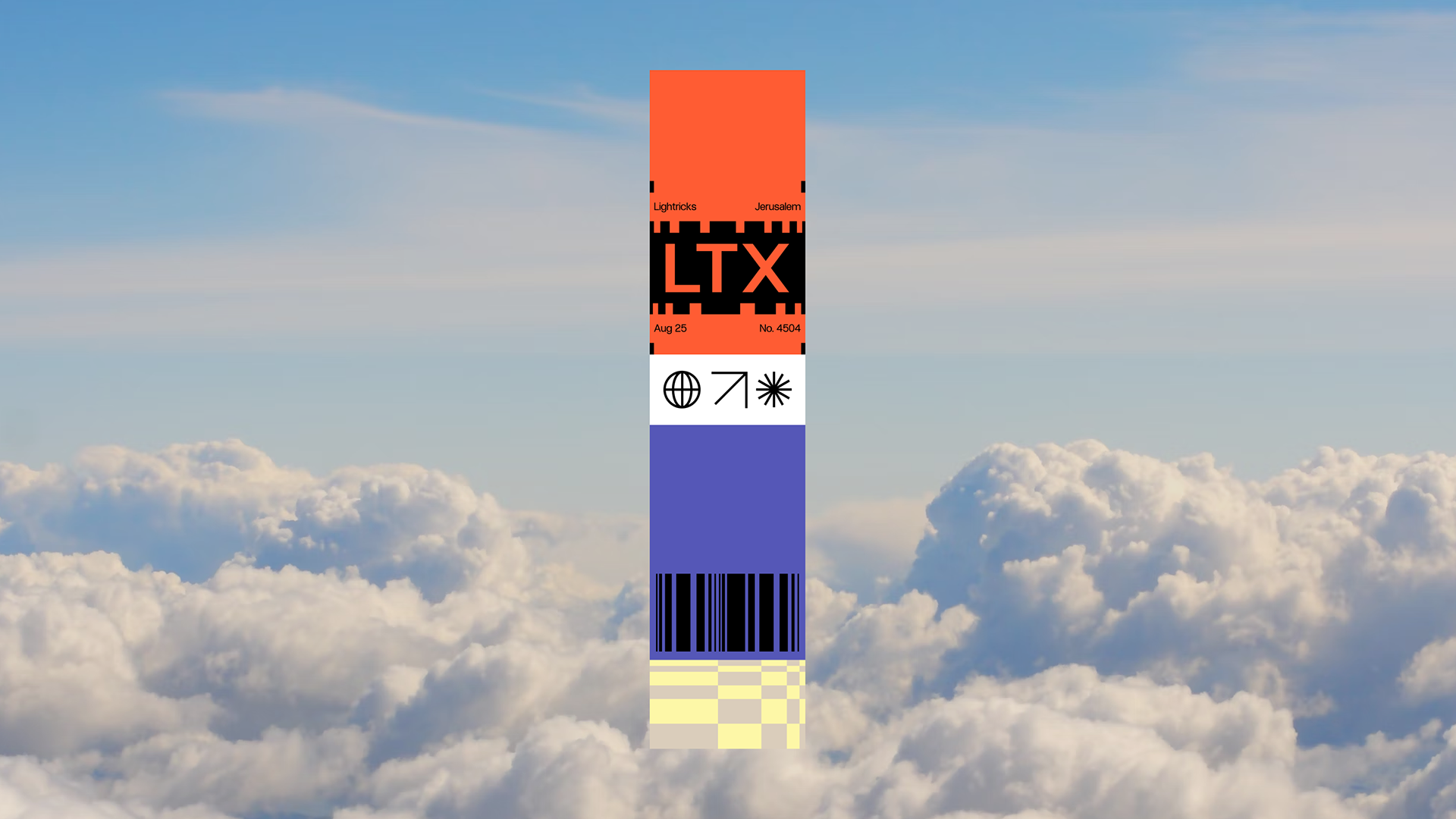
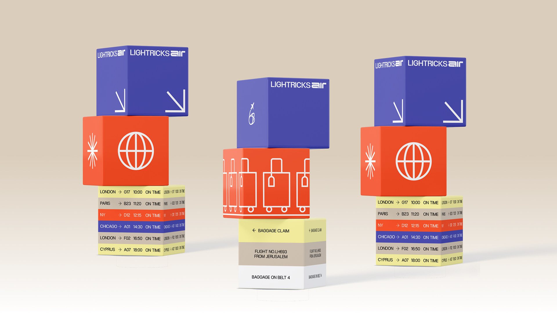
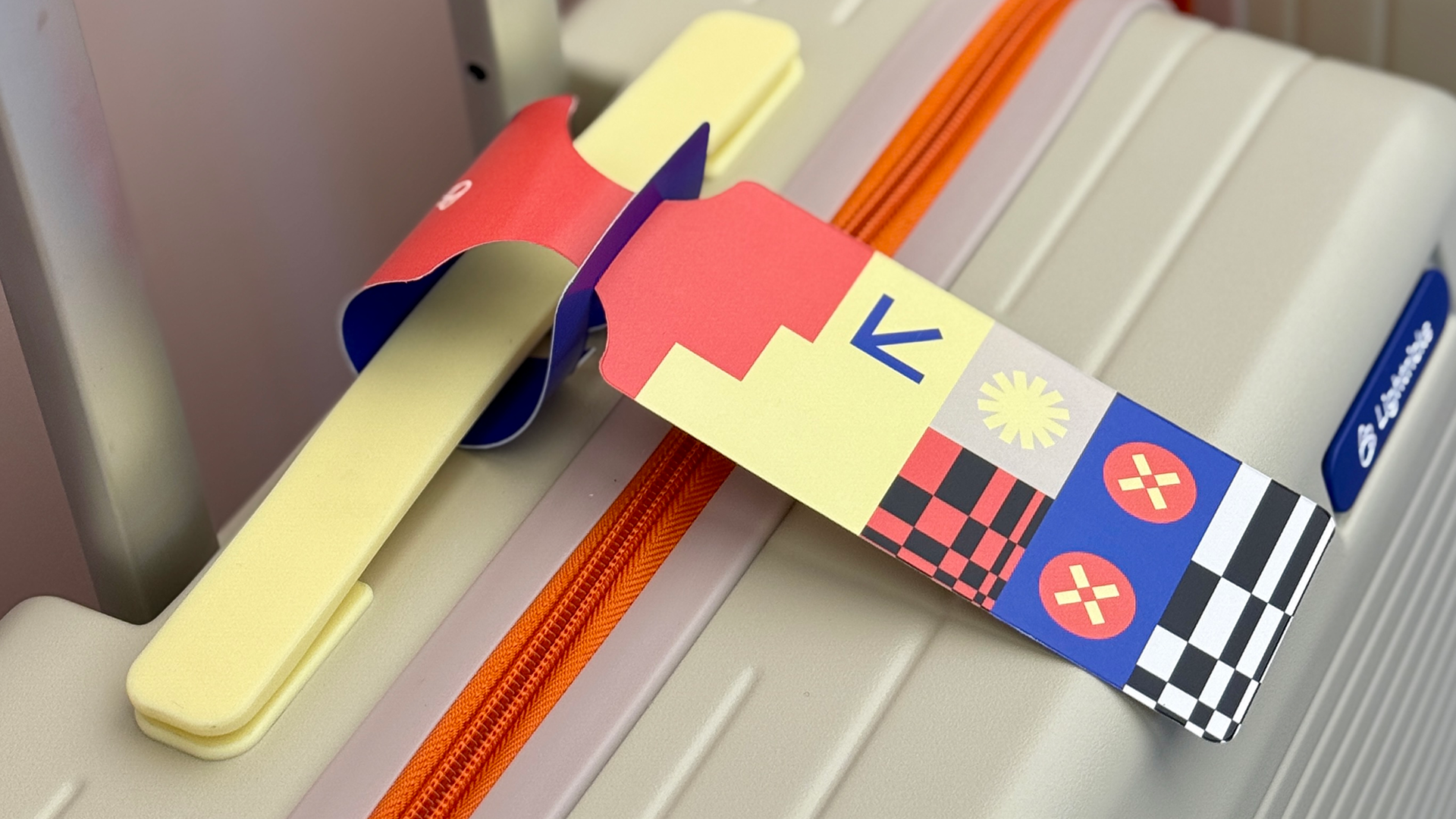
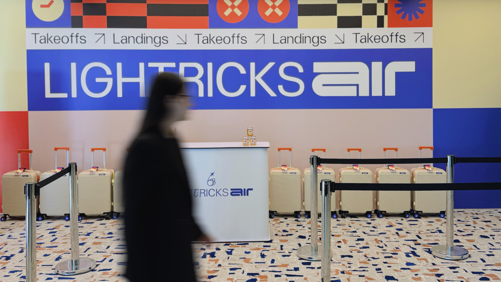
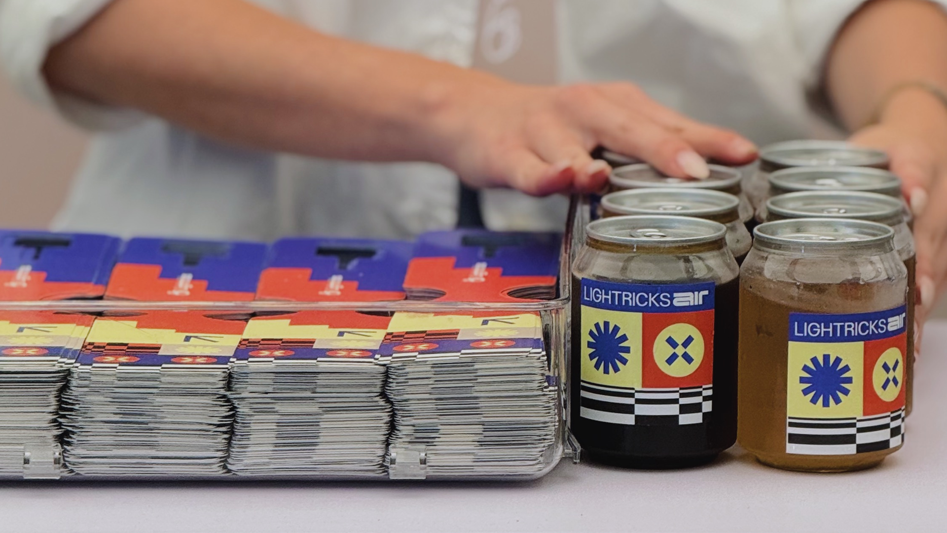
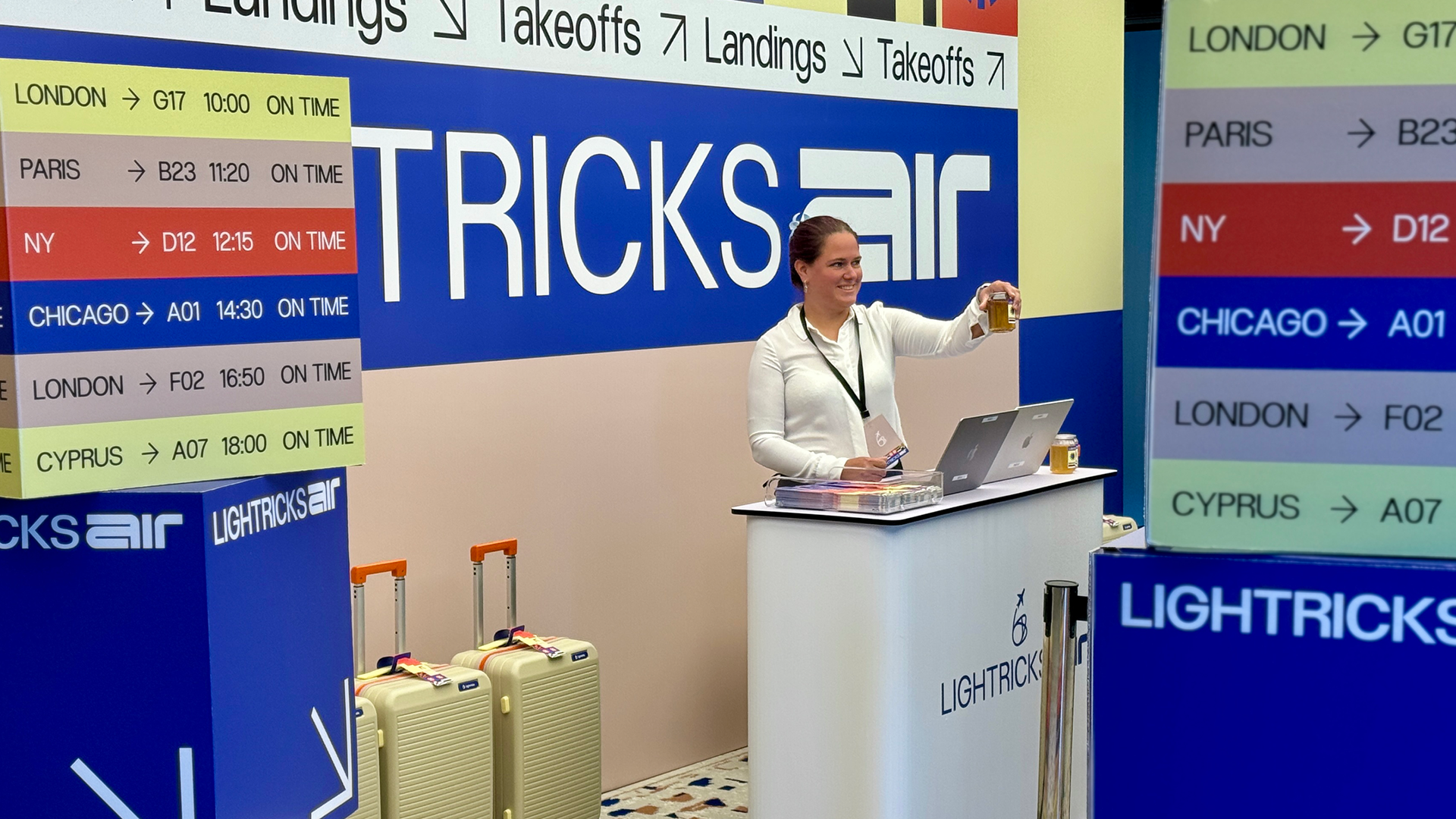
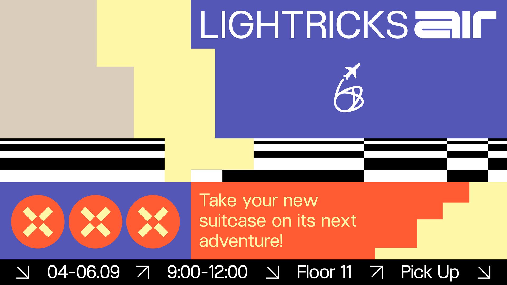
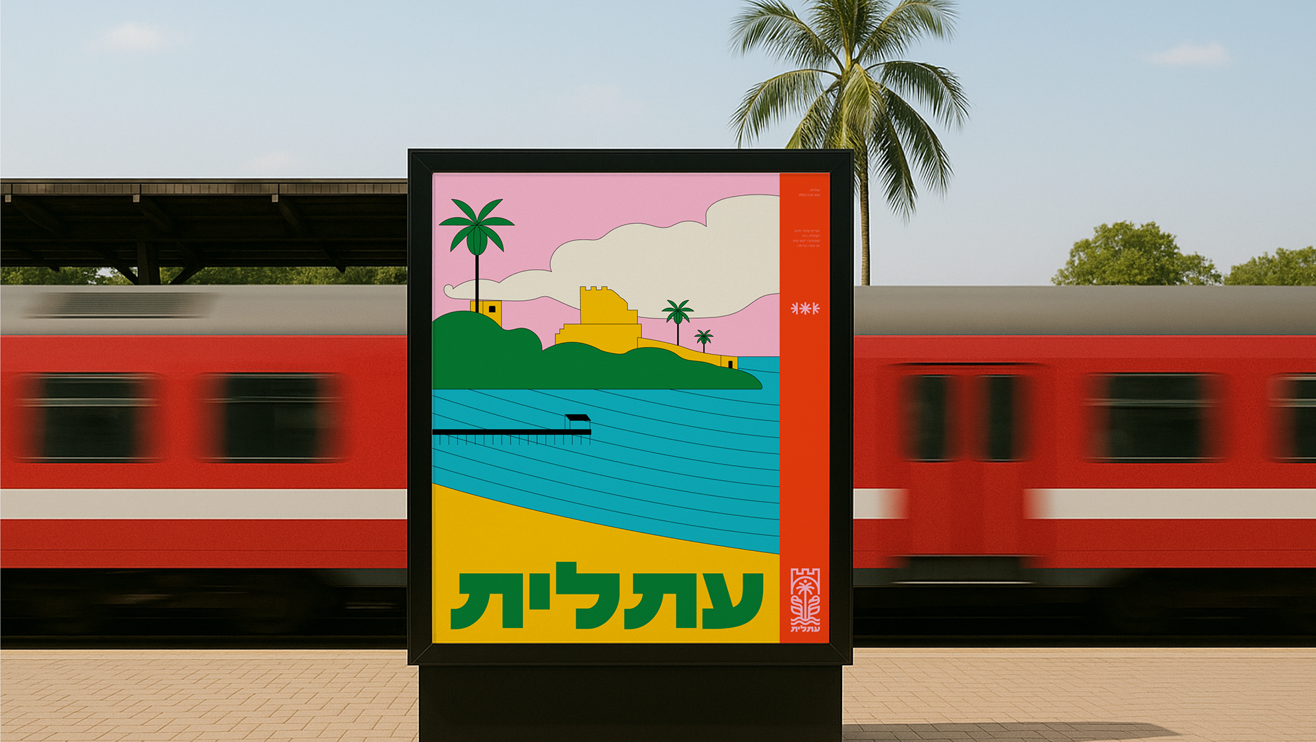
I created a branding concept for a terminal called Lightricks Air, inspired by the visual and experiential world of airports. The brand is designed as an airport terminal, using aviation as a metaphor for movement, departure, and adventure. The main inspiration comes from flight tickets, departure and arrival boards, barcodes, and navigational symbols commonly found in airports.
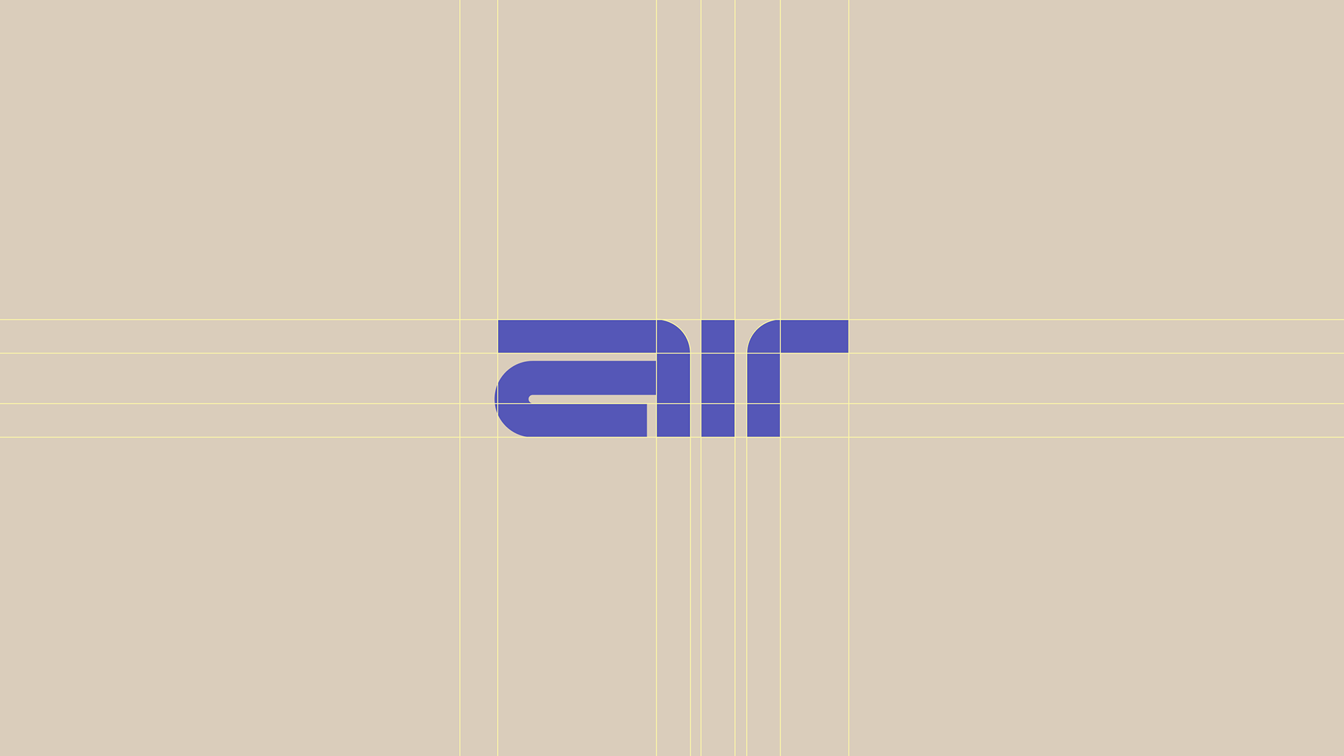
The visual language is based on structured grid compositions,
The visual language is based on structured grid compositions,
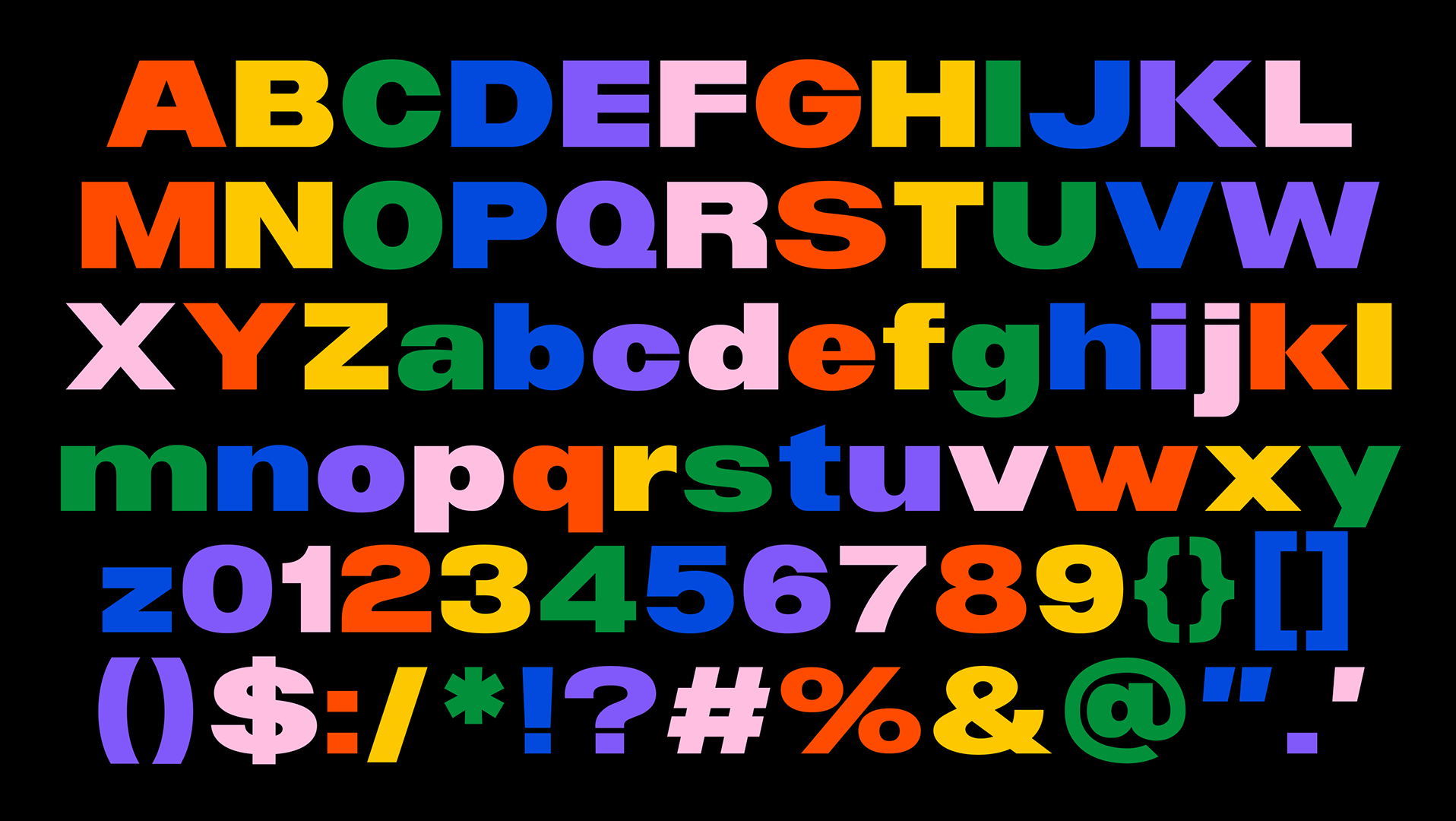
high-contrast color palettes, and clear, bold typography reminiscent of terminal signage, aiming to convey a sense of order, direction, and dynamism. Graphic elements such as barcodes, abstract icons, and fictional flight information were integrated to enhance the immersive experience and emphasize the idea of an ongoing journey that connects design, motion, and contemporary visual culture.