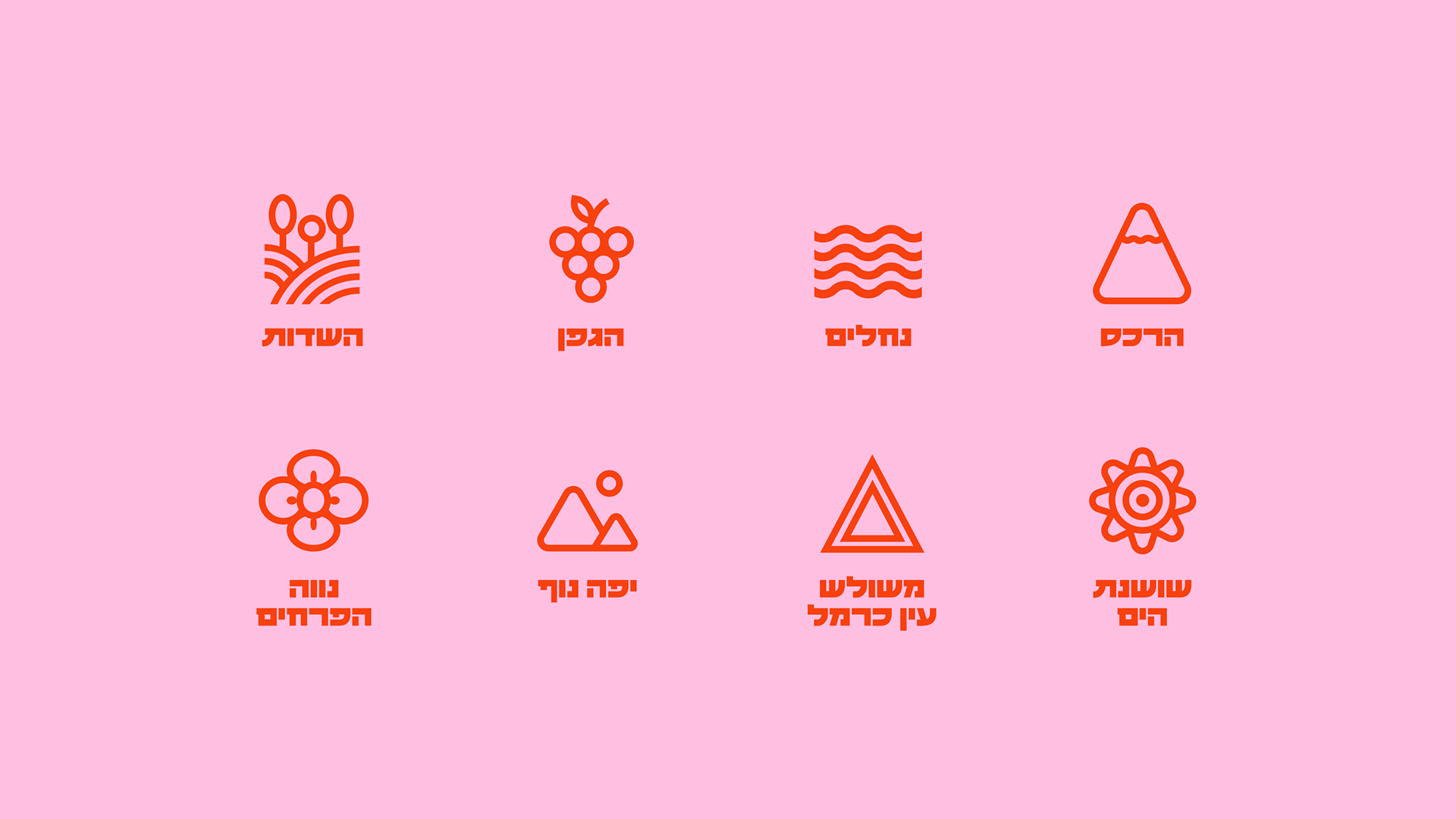
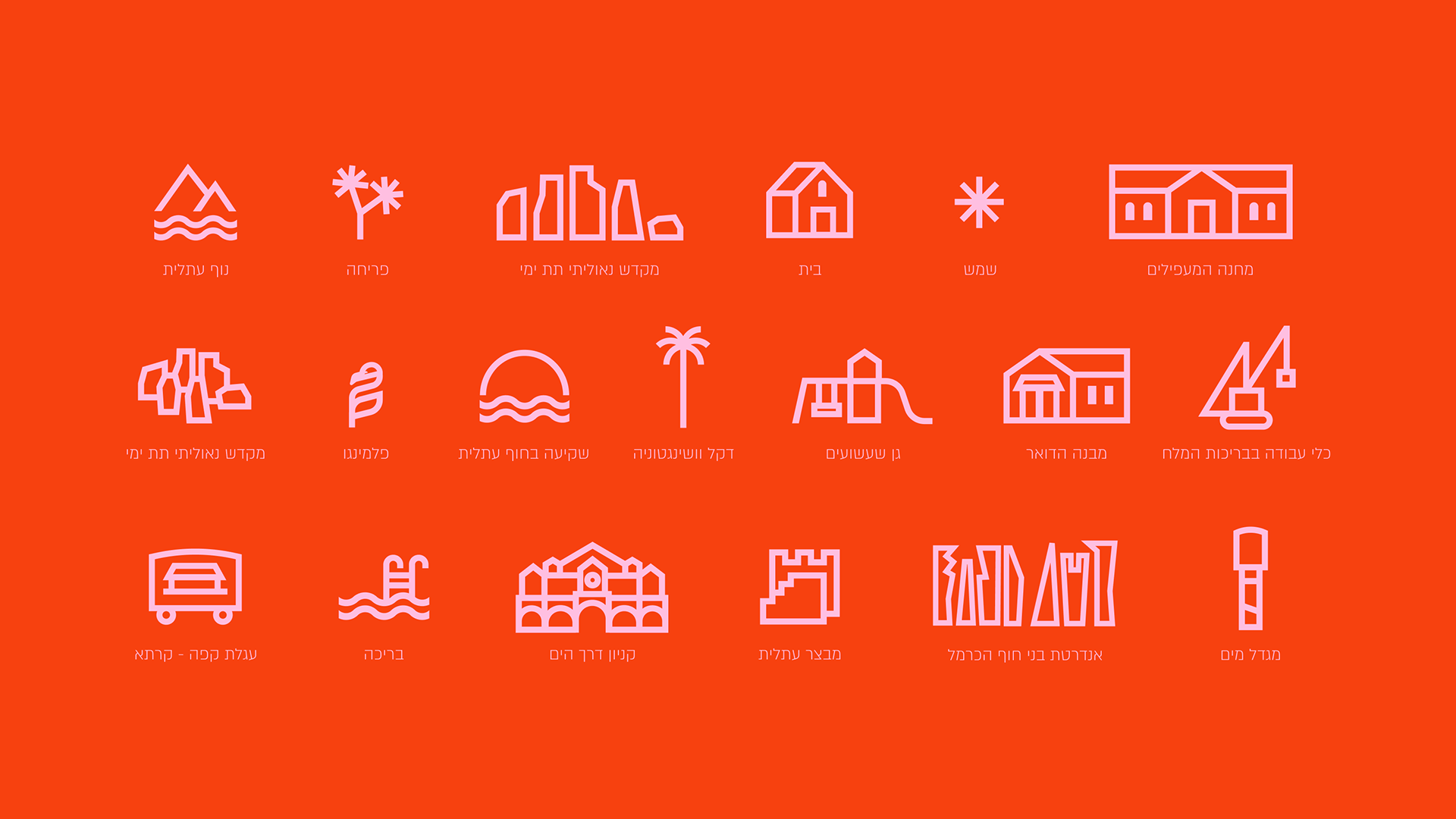
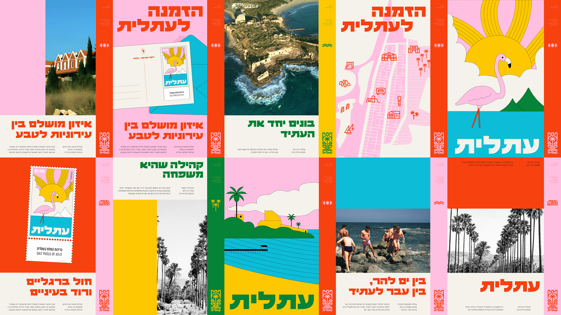
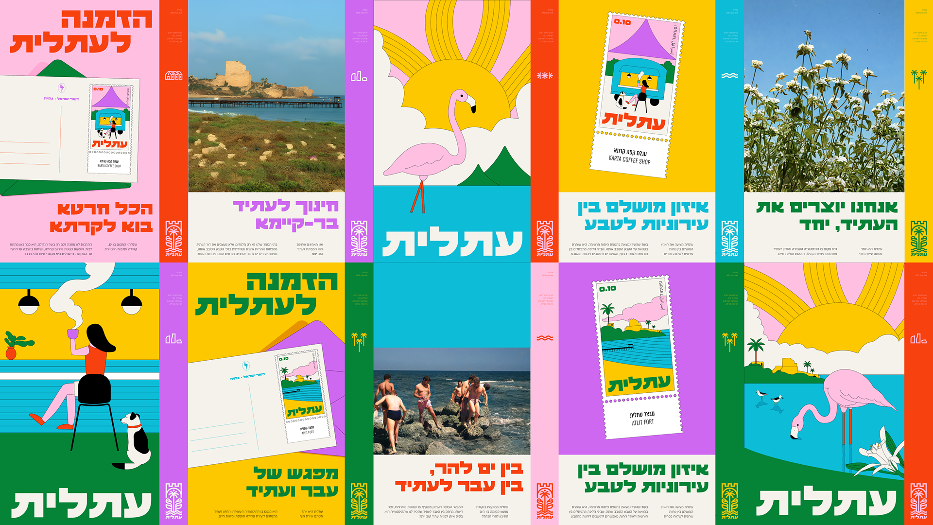
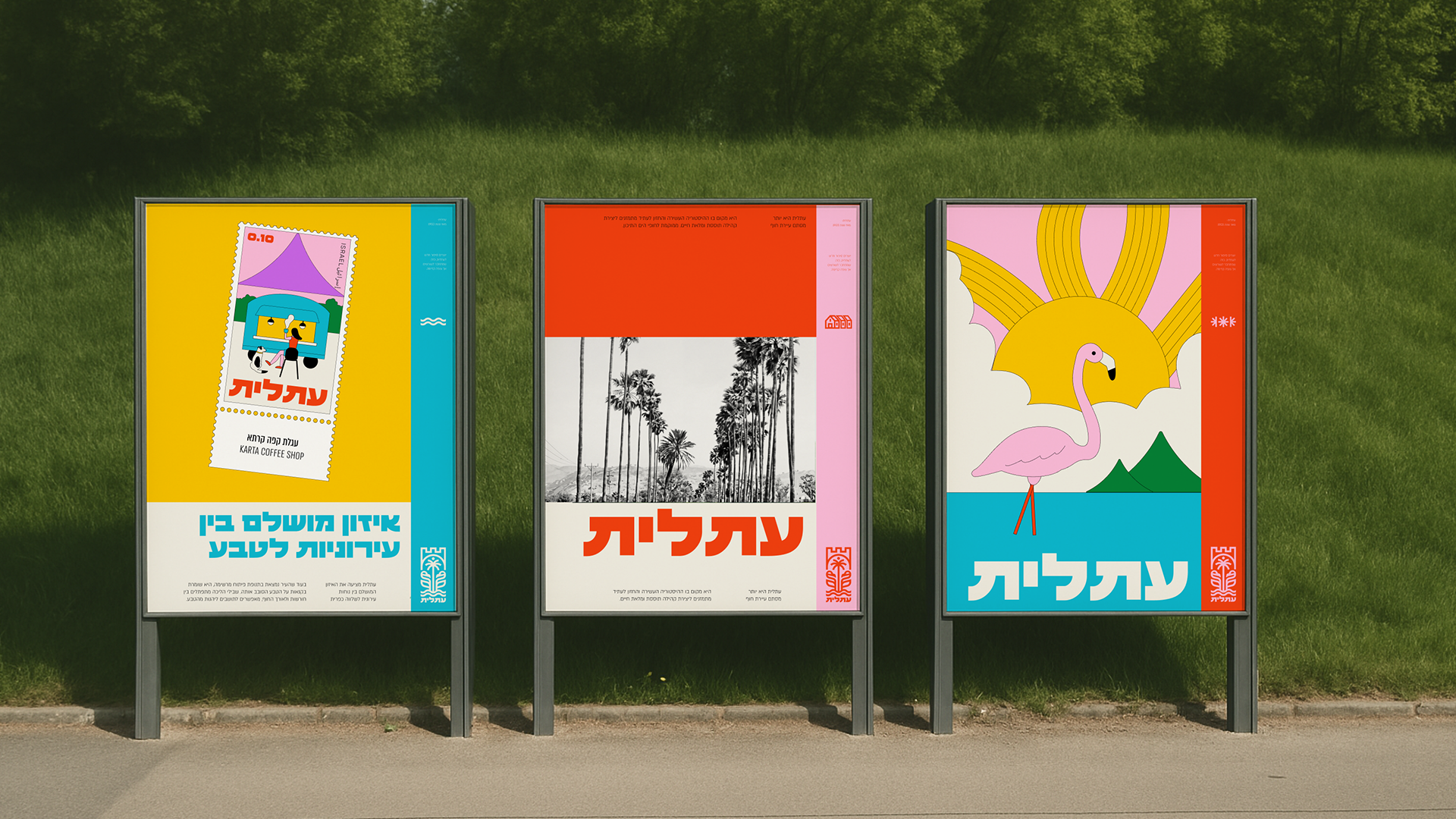
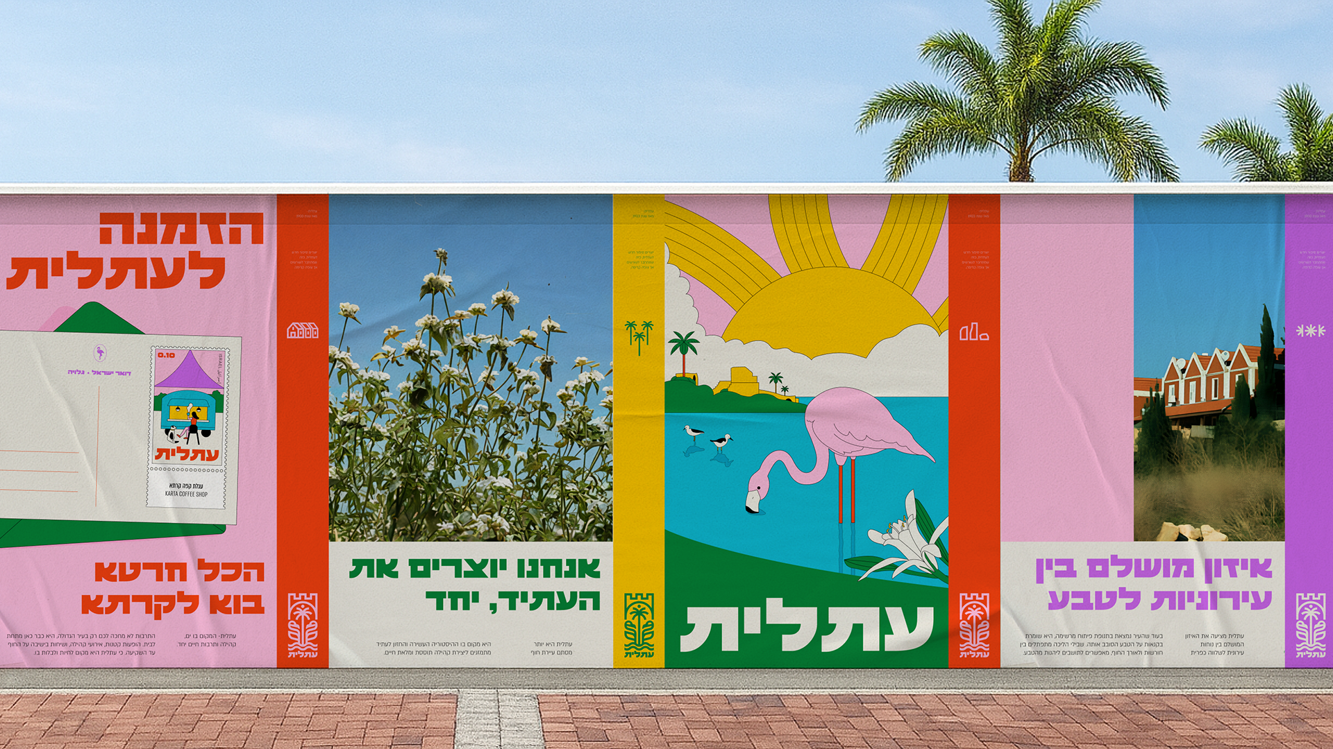
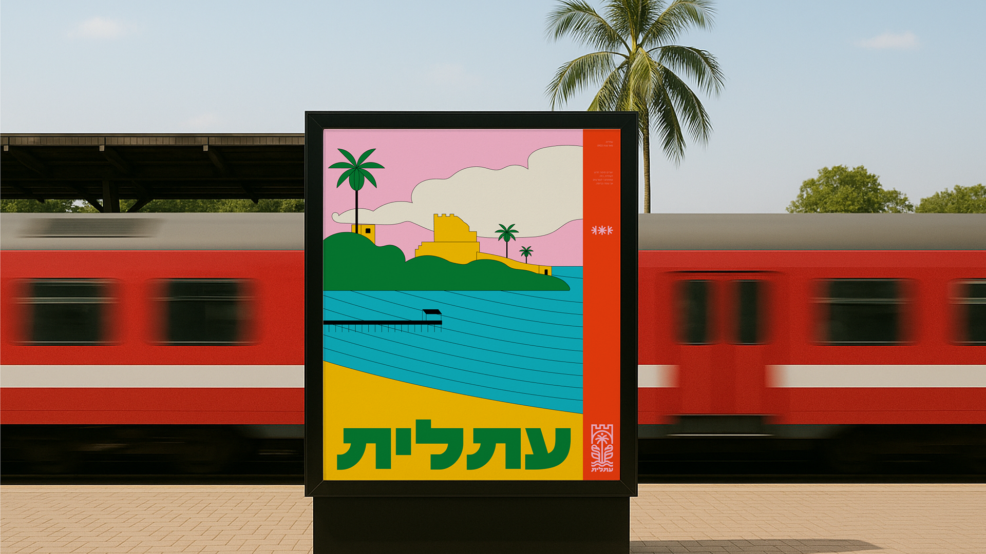
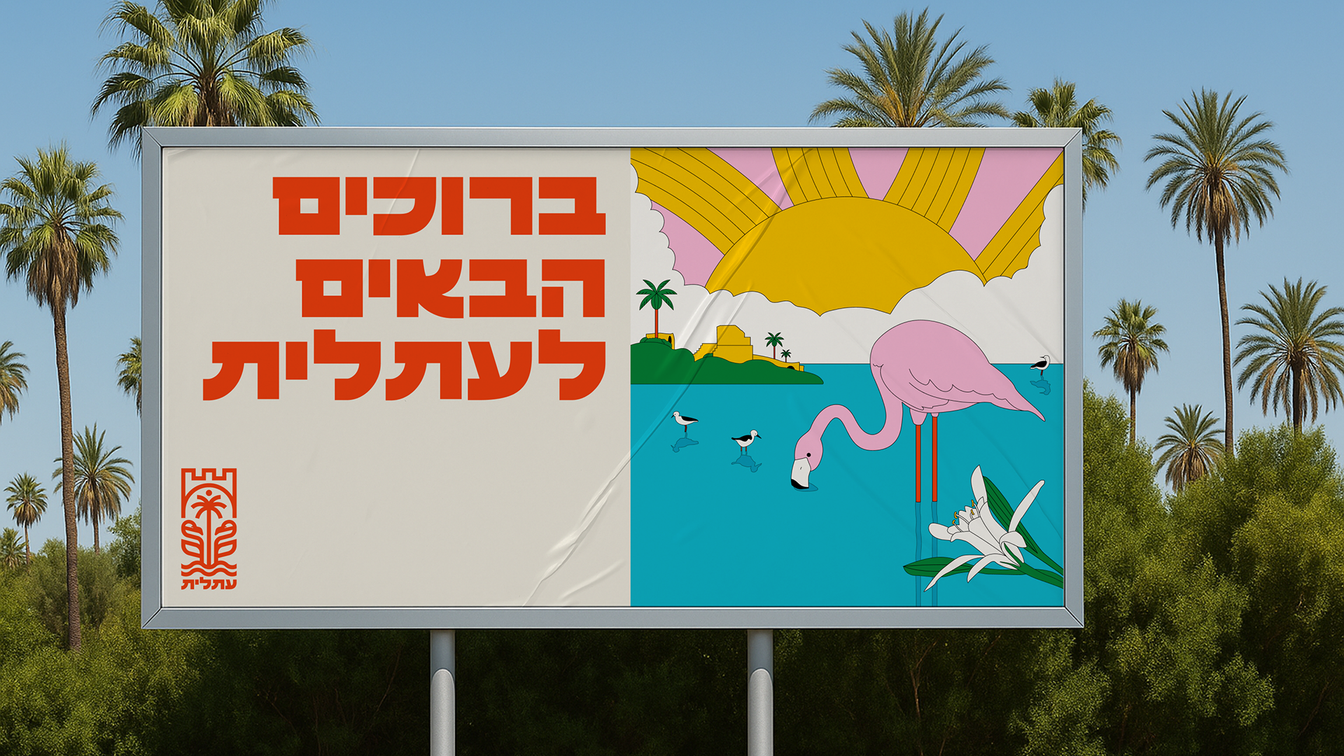
Atlīt’s branding is rooted in the place itself: layers of history, landscape, pain, and growth existing side by side. A coastal town shaped by Neolithic settlement, Crusader fortifications, a British detention camp, agriculture, salt, and sea - not as separate chapters, but as a continuous reality. Atlit does not resolve its contradictions; it carries them forward. The brand expresses this coexistence of old and new, memory and hope, city and nature, as an honest reflection of the place.
Rather than inventing a narrative, the branding extends an existing line. The name Atlit comes from ancient Semitic roots tied to coastal plants and salty soil - a name restored, not created.
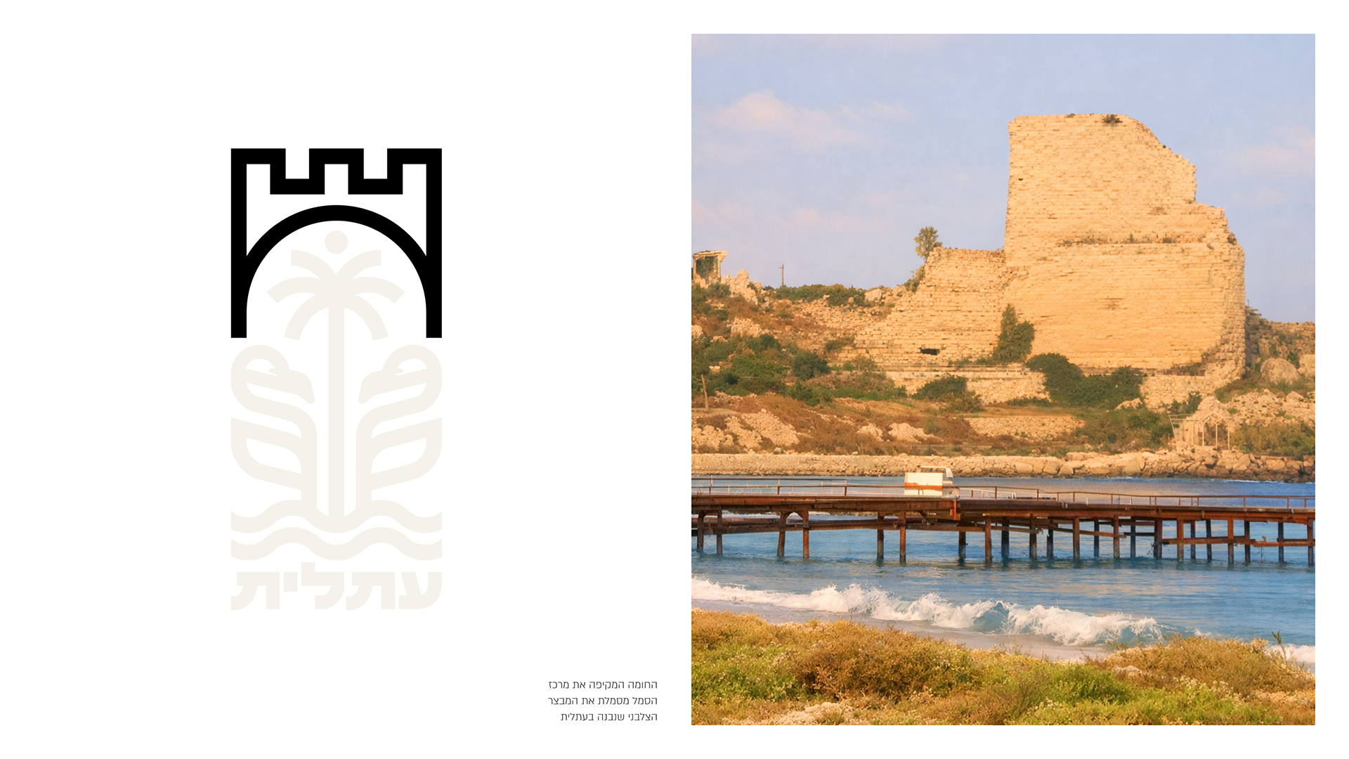
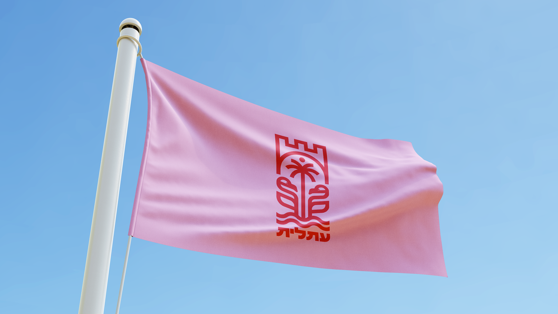
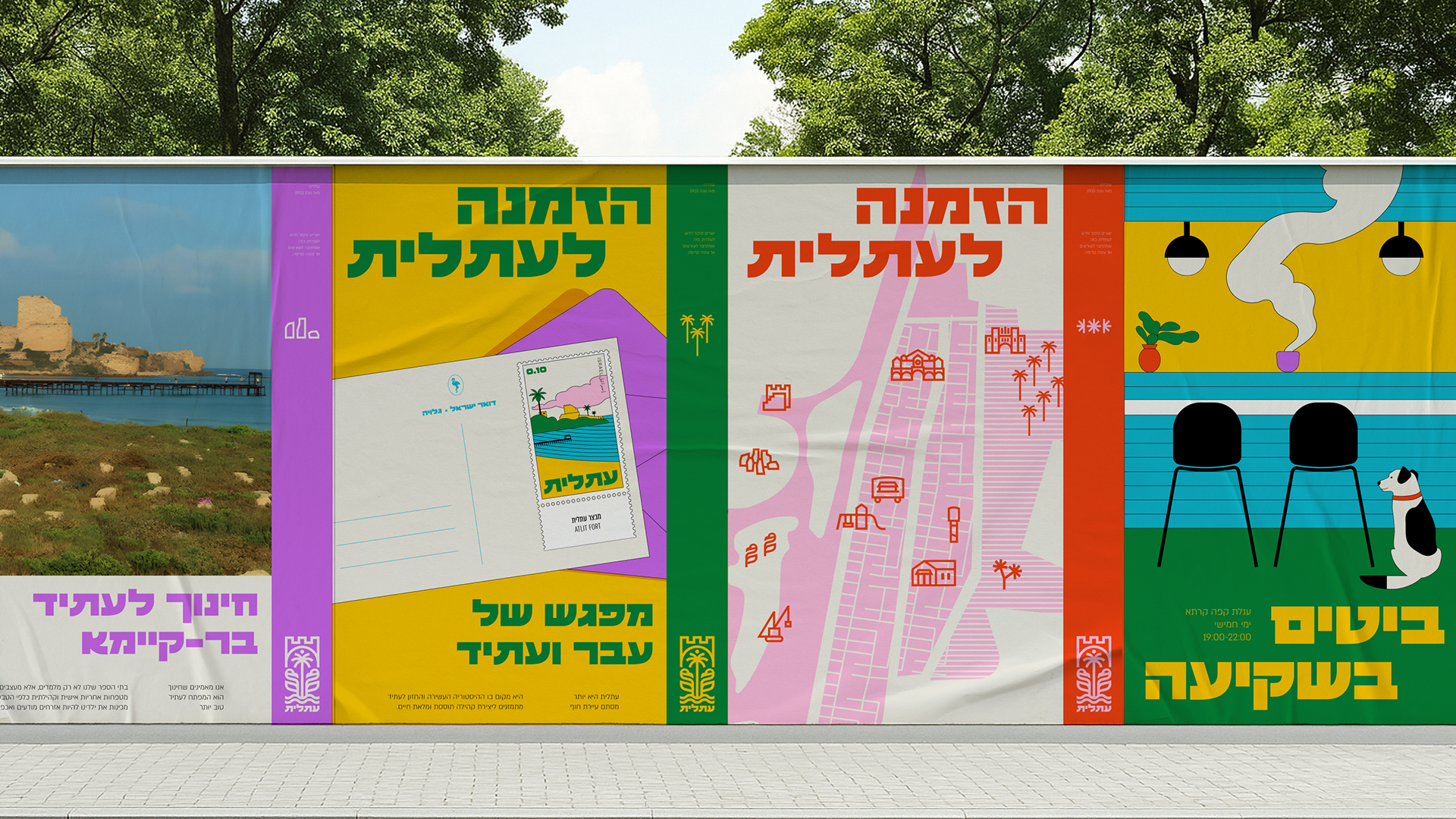
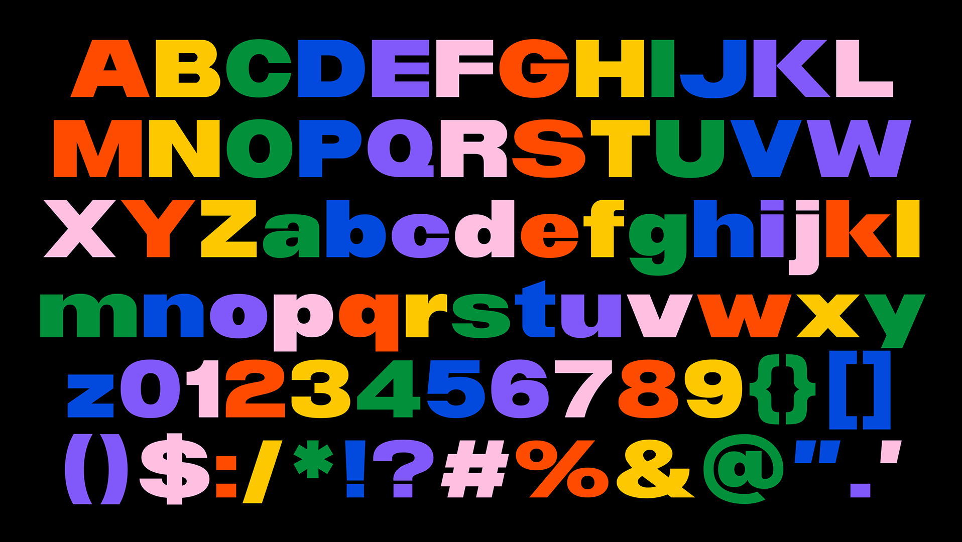
The visual identity builds on the understanding of symbols as carriers of meaning rather than decoration, referencing the original logo designed by Dror Ben-Dov. The new branding respects continuity across generations, honors what came before, and allows the place to speak in its own voice - restrained, grounded, and enduring.
Branding designed as part of studio under.
As the Brand Designer for this project, I created the logo, font, branding elements, including poster design, icon design, and other visual elements.
Branding designed as part of studio under.
As the Brand Designer for this project, I created the logo, font, branding elements, including poster design, icon design, and other visual elements.